In what ways does your media product use, develop or challenge forms and conventions of real media products?
- It uses, develops and challenges the forms and conventions of real magazine products in the way it uses the key media concepts in an attempt to go beyond the normal requirements. The masthead “the log” connotes the memories of school life and indulges in the happy memories like a diary. The smile face is written as type because it looks sleeker and sophisticated than an actual emoticon would.
- The strap-line further pursues the idea of good school memories with a use of conversational, chummy tone.
- The typeface, Courier New is similar to a typeface commonly used on the internet; its use of serif makes it look sophisticated, because serif fonts are connotated as professional and formal. The colour scheme utilised black, white and greys to emphasise the sleek sophisticated house style which I was trying to create.
- The menu strip was designed in a way that makes it look like a menu strip from a website. The headline “Exclusive with Nicole” sounds top-secret which as an enigma code allows the audience to guess and imagine what is in the interview. It is big to catch the reader’s attention. The lures on the menu strip are related to school issues making it obvious it is a school magazine. The price is a typical price and is bold, round and large so that it catches the reader’s attention, which is why it has been placed in the sweet spot. There is a lure for a “free poster” and a banner at the bottom advertising the competition.
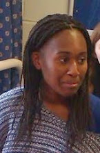
- The image used of the person who has been interviewed for the exclusive, her clothes make the colour scheme and the pose she has suggests a sophisticated nonchalant persona, her gaze is just away from the camera to the left side and the fact she is wearing sunglasses makes her seem mysterious and cool as another enigma code controls how the audience see her. The setting is a brick wall, which has the connotations of a back alley, or “the bike shed where the entire cool people hangout”.
- (Contents page) The title “contents” is a very self-explanatory title as it points out the function of the page.
- The main image is an image resembling an interview with the ‘star’ of the front cover which shows a friendly scene connoting a happy school, the text continues in a similar style to the front cover allowing the audience to make links, the secondary images explain visually what readers can expect on each page, the colour scheme continues on as it was on the front cover also allowing the audience to make connections and links between the two pages.
- The interview with Nicole, which the magazine would pay Nicole for so that they could get money back from copies they sell which, would gets Nicole more sales. This is why obviously the front cover portrays her in a positive light.
- The institution is the school as they issue the magazine they will censor the kind of information which is allowed to use for the magazine.
- Since it is a commercial institution there would be adverts to gain money for the magazine so that they would be able to make a profit. Therefore the head teacher would probably have the final word on what went in the magazine and knowing that some parents will see the magazine and the ages of the typical student who will buy it some things would not be appropriate and would therefore be censored out. The school has been distributed through the school.
- There is use of a barcode on the front cover and the contents page shows the website at the bottom.
- What was unconventional about my design was that it looked more like a music magazine than a school magazine which means it is not obviously identified as a school magazine and might be mistaken by my audience as a music magazine, or might be targeting the wrong audience.
How does your media product represent particular social groups?
- The language is aimed at 11-19 year olds of all ethnic groups, which is the age demographic for the whole school.
- The institutional work I’ve done has been very technology directed because the audience at which it is aimed are the ones who are likely to understand it.
- The audiences which I could there for reach would be secondary and sixth form students.
- This shows the stereotypical representations which have been used to sell the magazine to the social groups.
- However, I believe I haven't covered a sufficient range of ethnic groyups as there is a prominent urban atmosphere about my front cover which excludes other members of my target audience.
What kind of media institution might distribute your media product and why?
- Institutions that might distribute the magazine, apart from schools are, libraries and other places the school students would be known to interact.
- Stereotypical lifestyles of the students are used to sell to the institutions so that they can be assured that the magazines will sell.
Who would be the audience for your media product?
- The colours, text, images are models for images which I have used are meant to create a cool sophisticated persona which my audience consider them selves to be a part of.
- It speaks to the teenagers who believe they are cool without being rebellious and sleek without sounding stupid.
- Institutions like advertisers like this because they then know if the magazine appeals to their target audience and whether it will therefore reach their target audience.
- Using demographics, psychographics and behavioural variables, I have been able to build up a profile of the average student who would buy my magazine based on the look of my front cover.
- Evidence of this is in the the model used for image, who seems to be about the same age as my target audience which shows use of the age demographic to connect with the audience.
- More evidence is in the colour scheme which appealed to their personalities as sleek, sophistcated and cool and see themselves as explorers always the first to find the new craze or trend, which shows use of personality psychographic as a ways to appeal to what the audience is like.
- The price is evidence of use of behavioural variables, as it is so low it serves as an incentive to continue buying as well as the free poster which also largely appeals to the audience.
How did you attract/address your audience?
- Through use of language; I used competitions, a headline, and lures to entice the audience’s attention.
- I addressed them as if I was one of them. This way they did not feel patronised.
- The facial expression on Nicole's face was confident without being oppressive which is exactly what the image of the magazine is meant to be.
- The layout looked very professional which appeals to the audience because they are thought to like the safety of affrimed sophistication.
What have you learnt about technologies from the process of constructing this product?
- I have learnt about the importance quality of printing and how it affects the look of the product, up to date use of technology impresses audiences.
- All institutions involved like photographers, models, have to be given recognition.
- The way images are created set up, text is place and fonts used are affected by the type of technology you used.
- The software I used to create my front cover and contents page was Photoshop.
Looking back at your preliminary task, what do you feel you have learnt in the progression from it to the full product?
- I have learnt about the type of technology available to use when creating this task and how to best utilise it to get the best results.
- I have learnt a lot about how important audience and audience positioning when creating images for the task.
- I have also learnt how important colour, non-verbal and technical codes are and how they effect audience perceptions.