Monday, 19 April 2010

The Final Product


This is the final product.
The overall feedback from my target audience is that the front cover was very appealing and would definitely make them buy the magazine. The contents page with improvements seemed to follow on well from the cover and was much better. The double page spread was interesting and the design innovative. One person, Chris, 17, said "I really liked the front cover and contents page, and the double page spread was different and yet seemed like it could still be part of the same magazine." Overall, it seemed a good product.

Sunday, 18 April 2010

Research for Main Task

This is the front cover I deconstructed in my reasearch for my main task.


Masthead creates brand identity.
Long shot- he is looking directly at the audience implying confidence.
There is no more than three fonts used to created continuity across the page.
It’s clearly aimed at people in their twenties who enjoy music, possibly more aimed at males.
There is a lure which gives an insight as to what is inside. The quote is in capital letters which helps to catch the audience’s eye and connotes in importance and makes it seem like it is being shouted by the speaker at the audience.
The bar code is at the bottom with the price, website, issue date.
The coverline is White-on-black making it stand out and the question mark makes it rhetorical, making it interact with the audience.
The banner appeal to target audience who would know the band.
The masthead is simple and blunt, implying the magazine is blunt. The strapline is like a motto for the target audience. The banner is in the sweetspot so the audience will see it first which effictively target an aduience who know the band 'Razorlight'.

Other cover I look at include: NME, Kerrang, and The Word:


Through studying these magaizines, I learnt the codes and conventions used by real music magazines, which I can now employ in my own work.

Planning for Main Task

This was the brainstorm I created to produce ideas for my main task. I used it come up with the eventual title of my final product(LMFAO), to decide the genre I would cover with my magazine(urban dance music) and the audience I would target (16-19 year old boys from all classes and all ethnicities).


These are some of my original images.


This was quite a straightforward photoshoot and the blue tint came naturally due to the weather on the day which was very helpful.


This photo I duplicate and place a second copy at an angle to create the effect of therer being more than one shot and make them look like real photos.


I chose this image of myself as editor because I believed it suited the image of the magazine more as cool, sophistciated and streetwise.


This was the hardest photoshoot because, other people who were meant to be in it, didn't show up and we had to draft in a third actor to complete the shoot. Also we could not shoot at the original setting as the lighting there was so bad that no one could be seen in the photos. This is why I edited out the background. This image I later used in my double page spread. I used photoshop to remove the background.


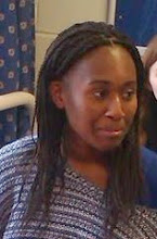
I cropped this image and scaled it down for my double page spread, and I also did this with the next image and another one.

All other photoshoots were successful and straightforward.

Preliminary - Planning and Final Product

This is the plan I created for my preliminary contents page.


This is the plan I created for my preliminary front cover.


This is the front cover I created for my Preliminary task based on my plan.


This is the contents page I created for my preliminary task based on my plan.


These are some of the original images I took to create my preliminary.


Research for Preliminary

This is the front cover school magazine I looked at when doing research for my preliminary.

There are coverlines, a masthead and a banner. There is not much to attract the viewer's attention in this piece. The font used is serif and very formal, there is only one photo and one font used. The coverlines and banner tell us a little bit about what's inside.


The contents page is no better, with only one small phot of the editor and a grid for the information it is fairly formal and boring. It is also not very interactive with the audience and the language used is quite impersonal.

Monday, 12 April 2010

New Contents Page after feedback

After receiving feedback on my contents page, I decided to amended it.


I decided, that due to feedback, my contents page needed to be improved to improve continuity most and to make it look better in general. I changed the colour scheme to match the colours used in the front cover, which I found were blue, red, white and black. I knew that by using these colours I could successfully create continuity between the front cover and the contents page. Therefore I have improved the continuity of the contents page using the pre-existing colour codes on the front cover.

Saturday, 20 February 2010

Feedback on Cover and Contents

I went round to six different people from my target audience to get feedback from them about what thaty thought of my front cover and contents. My target audience was 16-19 yr old boys.

Ben - 17
Front Cover: "It's really good, I really like the stamp effect."
Contents: "It's alright but the front cover's better."

Chris - 17
Front Cover: "It's really professional-looking, but not my sort of thing."
Contents: "This is not that great, I can't read the text."

Charles - 16
Front Cover: "It's amazing!"
Contents: "Not so amazing."

Dan - 17
Front Cover: "I would buy this magazine if this was the front cover."
Contents: "This is dissappointing, it doesn't live up to the promise of the cover."

Jeremiah - 16
Front Cover: "I thought this was a real magazine, it's quite good, really authentic."
Contents: "This doesn't lool like it's part of the same magazine, a bit of a letdown."

Leeon - 17
Front Cover: " It's alright, I quite like it."
Contents: "This is horrible, really bad."

All in all, I think I was given reasonably good feedbaack, but it seems I need to improve my contents page to a similar standard of my front cover.

Friday, 1 January 2010

Evaluation of Main Task(Cover & Contents)


Front Cover

• For the masthead, I chose a plain san serif font in black because I believed that the sans serif font seemed modern and mysterious. I knew that the masthead was one of the first things they would see, and would set up their ideas of what the magazine was like.
• It comes from IM language, but I changed it to mean ‘Life. Mates. Funk. Acting Out.’, which summarises the priorities of the target audience. It shows how the magazine is like an extension of the average member of the target audience. It also shows that the internet is something subconsciously important in the average member’s day to day life.
• I chose a strapline that I felt described what the magazine would be to the target audience.
• I styled my headline roughly on an issue of Q which I studied. I created a stamp effect for the word ‘Exclusive’ because my audience would think that it looks cool and the connotation of a stamp is that this is so exclusive it’s top secret, it’s confidential.
• The lures were also styled in a similar way to the lures on the Q issue. I continued to use the same font of them giving them a shadow effect so they would seem to leap out of the page and attract the viewer’s attention.
• I tried to make the competition relevant to my audience and the magazine and so I purposely put it in the sweet spot.
• The models look like typical members of my target audience. They represent the target audience, which is something the target audience would find attractive because they would like to be on the cover of a magazine. They are smiling and have cheeky grins and one looks like very annoyed. They are full of character and this makes the magazine seem full of character.

Contents Page


• The features are continued from some of the lures on the front cover.
• In the editorial I tried to be more interactive, something I realised I didn’t do a lot in the preliminary task.
• The main image is also an image of some one who looks like a member of the target audience. He has an open-mouthed smile connoting confidence and happiness, something which very important to my target audience.
• I continued to use the same font I used in the front cover and some of the text effects, to bring a sense of continuity to the two pieces so they would seem part of the same magazine.


• The target audience are young adolescent boys between the ages of 16 and 19. They are in sixth form or about to start university and are students. They are still not quite matured.
• Stereotypical lifestyle of the audience is used to sell to the institutions so that they can be assured that the magazines will sell. It would therefore most likely be found in a newsagent.
• Using demographics, psychographics and behavioural variables, I have been able to build up a profile of the average student who would buy my magazine based on the look of my front cover.
• The average member of my audience is most likely a reformer and still full of aspirations. He intends to look sleek and sophisticated but end up looking like a kid.
• The price is a way of telling what kind of person would buy this magazine. They most likely are upper working class to middle class. They may even have a job to have money for they endless obsession with ‘swagger’ as in their need for the latest fashion. The magazine appeals to their need for surveillance and diversion.
• I have learnt about the importance quality of printing and how it affects the look of the product, up to date use of technology impresses audiences. The new printer made my work look very professional.
• All institutions involved like photographers, models, have to be given recognition, which is why I put it small print on the contents page. It is also important make sure websites are on front covers for reference, due to the increasing intertextuality of magazines these days.
• The way images are created set up, text is place and fonts used are affected by the type of technology you used.
• The software I used to create my front cover and contents page was Adobe Photoshop.
• I would improve my contents page and the continuity between it and the front cover. I know they double page spread has to combine the characteristics of the two so that all pieces seem part of one magazine.